TOILET SIGN
Consistency is suprising when it comes to unexpected details in branding,
such as toilet signs.

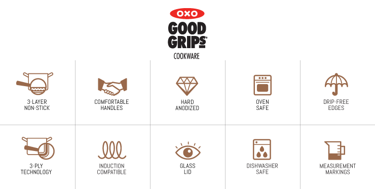
OXO COOKWARE FEATURES
OXO asked to create clean and simple symbols to explain the smart features of their cookware.
In a more symbolic way it’s clear where each symbol is standing for.
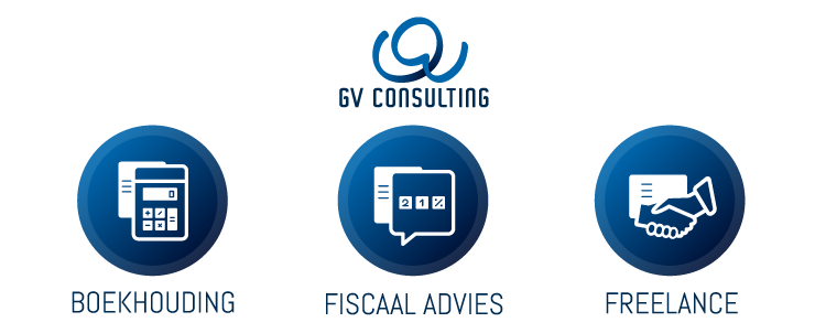
ACCOUNTANCY DIVISIONS
The client asked to create 3 category symbols to divide his website,
consistent with his logo.
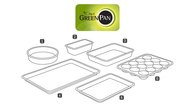
BAKEWARE ITEMS
As there exists a lot of bakeware products, it’s much easier
to have clear illustrations in stead of pictures to show their difference in shape.
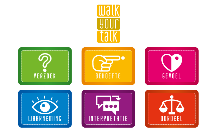
STEPS OF CONNECTING COMMUNICATION
The client asked to have A3 format papers to put on the ground for a workshop
to easily show the different steps of connecting communication.
As the colors are chosen as flashy and impressive as possible,
that gives the scene a more playful atmosphere.
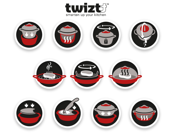
USE OF SMART DESIGNED COOKWARE
Twiztt is a smart designed cookware brand that wants to show the possibilities
of their products with attractive icons. The client asked us to create icons in the same style
of their other corporate identity elements.
©STUDIO SJALOT